Written by L.K. Monu Borkala, Founder, OneCity Technologies (CIN: U72100KA2009PTC048911), Bangalore. 20 years in business. +91 99023 30233. A mobile friendly website benefits every metric you track, because most of your visitors are on phones.

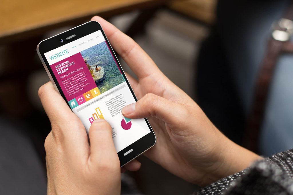
We all know the importance of websites for your business. Quoting Bill Gates, the co-founder of Microsoft Corporation – “If your business is not on the internet, then your business will be out of business” It is the age of the internet and the whole world has become a global marketplace. Therefore, having a website has become a necessity now and is no longer a luxury. Websites are economical and easy to create and maintain. It is the key to your business and the very first impression you create with customers. Now that we have established the importance of websites for your business, the question arises as to what is the best medium for websites. When it comes to choosing the right medium, we have a clear-cut winner – the mobile device. We choose mobile over all other devices as it is the most used device around the world. It is convenient to use on the go. Small and handy to carry and is a versatile device. By versatile we mean that mobile can perform almost every function that a PC or laptop can do. So, if we put our above findings together, we can conclude the importance of a mobile-friendly website. Mobile-friendly websites refer to websites that work perfectly well on mobile devices or smartphones. Websites that have quick page speed load time and have easily clickable links and can be easily handled through mobile devices are considered mobile-friendly websites.
Let Us Look at The Benefits of Mobile-Friendly Websites
1. Worldwide Use of Smartphones
 According to a survey conducted by statista.com in December 2020, the number of smartphone users worldwide has crossed three billion and will surpass this figure by several 100 million in the coming years. This reveals the mammoth population already on smartphones. Therefore, creating a mobile-friendly website will contribute to garnering more customers.
2. Smartphone Usage
An article published in gadget-cover.com stated the usage of smartphones.
- Texting 88%
- Email 70%
- Facebook 62%
- Camera 61%
- Reading news 58%
- Online shopping 56%
- Checking the weather 54%
- WhatsApp 51%
- Banking 45%
- Watching videos 42%
Though these figures may have varied over the years, the underlying point here is that most of these uses of the smartphone require the application of a website. Online shopping requires the seller to have a website that allows the customer to select from various products available online.
3. Engaging the Customer
Another reason why your website should be mobile-friendly is that if you have a website that manages to attract customers, you have a greater chance of engaging them for a longer period and which helps convert sales into profits. A mobile-friendly website that loads fast, does not require much to zoom in and out and has workable and clickable links. This way the customer is kept engaged on your website page and tends to spend more time on the website. This is more likely to convert casual browsing into sales. A survey by hobo.web.co.uk revealed that 53% of users abandon a website if it takes more than 3 seconds to load. A 2second delay in load time can result in abandonment rates of up to 87%. Therefore, it establishes the importance of a mobile-friendly website. Mobile friendliness is one of the factors which determine the ranking of the site.
4. Keep Customer Loyalty
A mobile-friendly website makes sure customers are loyal to your brand. A good website in turn garners sales which ultimately leads to profits for the business. Also, a customer is likely to revisit a mobile-friendly website and recommend it to another. A mobile website that does not work well, may not attract customers back to the website. According to thinkwithgoogle.com, If people have a negative experience on mobile from your website, they are 62% less likely to purchase from you in the future. Therefore, having a negative mobile website experience may have a negative impact on the sales of your business
5. Surpass Competitors
One of the benefits of having a mobile-friendly website is that you can keep up of your competitors in the business. When two businesses are showcasing and selling the same products and services online. The customer will choose the business with a mobile-friendly website and recommend it to others too.
6. Easy Navigation
Mobile-friendly websites are easy to handle. The portable device and size of the screen contribute to the easy navigation of websites through mobile device or smartphones.
7. Google Mobile Indexing
Realising the rise in the use of mobile phones, Google announced the mobile-first indexing of the web. Mobile-First indexing means that Google will use the mobile version of a website for indexing and ranking. This is to help the vast population of mobile users find what they are looking for. Therefore, if your website is not mobile-friendly, it may not appear in the search engine index. You May Also Like Core Web Vitals Optimization
8. Mobile Website Designs Are More Attractive
 Another benefit of a mobile-friendly website is that is more attractive to the user. A user who uses the mobile phone to browse through different websites will not want to change the screen into horizontal or vertical mode to view your website. Therefore, by designing a good website keeping in mind its use on the mobile too, you can win over a large number of customers.
9. Mobile Devices Are Research Platforms
A survey published on aumcore.com stated that 62% of consumers worldwide use mobile devices to research products and services before actually purchasing them. Research is usually conducted by going into a particular website to find out more about the product or service. That is why your website should be mobile-friendly.
10. Easily Transferable Information
A mobile-friendly website is easily sharable. This means that when a user would like to recommend a website to another prospective customer, the website link can easily be shared and posted through any of the messaging apps. The process of sharing the link is far easier on a mobile device than on a laptop or PC. The quick sharing of website links means the fast dissemination of information amongst prospective consumers making your business more visible in a short period.
11. Mobiles Are Used for Local Searches
Local searches are usually made on mobile devices since the user requires the information as per the location at that moment. Mobile devices and smartphones are on-the-go devices and are mostly the only devices available on movement. Therefore, these devices are used for local searches and “near me” searches. One of the benefits of having a mobile-friendly website is that it allows you to be visible for a local search.
Conclusion
Having spoken about the importance of mobile-friendly websites, it is evident that businesses must mould websites to better fit mobile devices. It is advisable to optimise business websites for mobile devices and smartphones. Is your website mobile-friendly!? You May Also Like Static Website Vs Dynamic Website
What Mobile-Friendly Actually Means in 2026
“Mobile-friendly” has evolved far beyond the basic responsive design definition from 2013. In 2026, a genuinely mobile-friendly website for an Indian business means optimised for the specific devices, network conditions, and usage patterns of Indian mobile users — which differ significantly from the US or European contexts where most web design conventions originate.
India's mobile internet user base exceeded 650 million in 2024 according to TRAI data, with the majority accessing the internet exclusively on mobile devices, predominantly on mid-range Android phones (Redmi, Realme, Samsung Galaxy A-series), and on 4G connections that vary between 5–30 Mbps depending on location and network congestion. A website designed and tested on a high-end iPhone on a broadband connection is not meaningfully tested for Indian mobile users.
At OneCity Technologies, we test every client website on representative Indian mobile hardware before launch — specifically mid-range Android devices under 4G connections. This testing consistently reveals issues that desktop and premium device testing misses: font sizes that require pinch-to-zoom, buttons too small to tap accurately, forms that autofill incorrectly on Indian mobile keyboards, and images that load too slowly on inconsistent 4G connections.
The Direct Business Impact of Mobile Performance
Conversion Rate
The relationship between mobile usability and conversion rate is direct and well-documented. Google's own research found that 61% of users are unlikely to return to a mobile site they had trouble accessing, and 40% visit a competitor's site instead. For a Bangalore business receiving 1,000 monthly mobile visitors with a 2% conversion rate, improving mobile usability to achieve a 3% conversion rate means 10 additional enquiries per month — without spending a single additional rupee on acquisition.
The mobile conversion gap — the difference between desktop and mobile conversion rates for the same website — is the most practical metric in web analytics for most Bangalore businesses. Check your GA4 data: segment conversions by device category (mobile vs desktop) and compare conversion rates. A gap of more than 50% (desktop converting at 3%, mobile at 1.5%) indicates fixable mobile UX problems, not simply different intent between mobile and desktop visitors.
Bounce Rate and Session Duration
Mobile users on poor connections and mid-range devices make instant quality judgements. Research consistently shows that 53% of mobile users abandon a site that takes more than 3 seconds to load. On a site with a 4-second load time on mobile, over half the visitors leave before seeing any content — making every upstream acquisition cost partially wasted.
Session duration on mobile is typically shorter than desktop because mobile browsing is often interstitial — between other activities, with frequent interruptions. A mobile-optimised website respects this by surfacing the most important information immediately, placing calls to action visibly without requiring scroll, and making contact (phone, WhatsApp, form) achievable in under two taps.
Google Mobile-First Indexing: The SEO Consequence
Google switched to mobile-first indexing in 2023, meaning the mobile version of your website is what Google crawls and uses to determine rankings — not the desktop version. For businesses whose mobile site has different content, different internal link structures, or fewer structured data implementations than the desktop version, mobile-first indexing directly suppresses organic rankings.
Common mobile-first indexing failures that affect Bangalore business websites:
- Content hidden on mobile: Some responsive designs hide sections or tabs on mobile that are visible on desktop. Google does not count hidden-on-mobile content for indexing purposes — text inside collapsed accordions or display:none elements may not be indexed.
- Different internal link structures: If your desktop navigation includes links to all service pages but your mobile navigation only shows top-level categories, Google's mobile crawler may not discover and index all your service pages.
- Missing structured data on mobile: If JSON-LD schema markup is only present in desktop page templates and not in mobile, Google's mobile-first crawl will not see it — meaning no rich results for your mobile-indexed pages.
- Images not loading on mobile: JavaScript-based lazy loading implementations that do not work correctly on Chrome for Android prevent Google from seeing and indexing image content.
Run a mobile-specific crawl with Screaming Frog (set the user agent to Googlebot Smartphone) to audit your site from Google's mobile perspective. The findings are frequently different from a desktop crawl and reveal mobile-specific indexation issues that desktop tools miss.
Core Elements of a Truly Mobile-Friendly Website
Touch Target Size
Google's mobile usability guidelines specify a minimum touch target size of 48×48 CSS pixels for interactive elements — buttons, links, form fields. Smaller targets produce accidental mis-taps that frustrate users. On mid-range Android devices with lower screen density than flagship phones, even the 48px minimum can be difficult to tap accurately. Our recommendation for Bangalore business websites: 44–52px minimum height for all interactive elements, with at least 8px of spacing between adjacent targets.
Font Size and Readability
Body text below 16px forces mobile users to pinch-to-zoom to read comfortably. Google's mobile usability audit flags text below 12px as a critical issue. For Indian business websites where content is information-dense — service descriptions, pricing, technical specifications — 16–18px body text with 1.6 line height produces comfortable reading on mobile without requiring zoom.
Viewport Configuration
The viewport meta tag — <meta name="viewport" content="width=device-width, initial-scale=1"> — must be present in every page's head. Without it, mobile browsers render the page at desktop width and scale it down, producing microscopic unreadable text. This is a basic implementation requirement, but we still encounter Indian business websites missing it.
Form Optimisation for Indian Mobile Users
Contact forms are the primary conversion mechanism on most Indian service business websites. Mobile-specific form optimisations that significantly improve completion rates:
- Use
type="tel"for phone number fields — triggers the numeric keypad on mobile instead of the full keyboard - Use
type="email"for email fields — triggers the email-optimised keyboard with @ key visible - Enable autocomplete attributes (
autocomplete="name",autocomplete="email") — allows browsers to pre-fill fields from saved data, reducing friction - Make form fields at least 48px tall — easier to tap and visually clear on mobile screens
- Place the submit button at the bottom of the form, full width — easy to find and tap on mobile
WhatsApp as a Mobile Conversion Tool
WhatsApp is India's dominant messaging platform with over 500 million Indian users. For Bangalore businesses, a prominent WhatsApp click-to-chat button on the mobile website is frequently the highest-converting call to action — often outperforming traditional contact forms because users prefer the familiarity and immediacy of WhatsApp communication.
Implement a floating WhatsApp button using the wa.me API: https://wa.me/919902330233?text=Hi%20OneCity%2C%20I%20have%20a%20query. The pre-filled message reduces friction further — the user only needs to tap Send, not compose an opening message. Place the button in the lower-right corner of the mobile viewport, floating above the page content, visible on all pages. This single implementation consistently produces more mobile enquiries than any other UX change we make for clients.
Mobile Page Speed: The Bangalore Context
Bangalore's 4G network speed varies significantly by location and time of day. The IT corridors — Whitefield, Electronic City, Koramangala — have strong indoor 4G coverage. Residential areas like Rajajinagar, Jayanagar, and parts of North Bangalore have more variable coverage. A website that loads in 2 seconds on a fast 4G connection may take 5–8 seconds on a weaker signal.
Design for the worst realistic connection your audience will use, not the best. Test your site on WebPageTest with connection speed set to “3G Fast” — this simulates the lower end of what Indian mobile users experience and reveals load time problems that fast-connection testing masks. If your site takes more than 4 seconds on a 3G Fast connection, a significant proportion of your Bangalore mobile visitors are experiencing unacceptable load times.
The fixes: image compression (WebP format, proper dimensions), page caching, Cloudflare CDN, deferred JavaScript, and server response time improvement. These are the same optimisations that improve Core Web Vitals scores — mobile performance and SEO performance are the same problem viewed from two angles.
Testing Your Mobile-Friendly Status
- Google Search Console — Mobile Usability report: Lists all pages with mobile usability errors — clickable elements too close, text too small, viewport not set. Fix all flagged issues before any other mobile optimisation work.
- Google PageSpeed Insights — Mobile tab: Provides LCP, INP, and CLS scores specifically for mobile, with diagnostics. The mobile score is typically 15–25 points lower than desktop for the same site.
- Chrome DevTools — Device emulation: Press F12 in Chrome, toggle device toolbar, and select different device presets. Test at Redmi Note 13 or Samsung Galaxy A54 dimensions for representative Indian mobile user perspective.
- Real device testing: The definitive test. Borrow a mid-range Android device and browse your site as a first-time visitor would. The friction points you encounter in 2 minutes of real-device browsing are the ones costing you conversions daily.
For a mobile usability audit and optimisation service covering UX, speed, and conversion, contact OneCity Technologies at +91 99023 30233. Author: L.K. Monu Borkala, Founder & CEO, OneCity Technologies, 20 years in business.
Mobile-First Design Principles for Bangalore Service Businesses
Mobile-first design means designing the mobile experience before the desktop experience — building up from the smallest screen rather than scaling down from the largest. For Bangalore service businesses where the majority of visitors arrive on mobile, this is not a design trend but a business necessity. The desktop version of a mobile-first site is an enhancement. The mobile version is the product.
Navigation: Mobile navigation should prioritise the three or four actions a visitor is most likely to take: view services, see pricing (or request a quote), contact you, and read about your credentials. A hamburger menu with 12 items forces the user to hunt for what they need. A bottom navigation bar or a sticky header with 3–4 primary actions serves the majority of mobile visitor needs immediately.
Above-the-fold content on mobile: The content visible before scrolling on a 375px width screen is roughly 500–600px tall — a very limited canvas. Use this space for: your primary value proposition (one sentence), a trust signal (years in business, client count, or a specific result), and a primary call to action button. Everything else can be below the fold. A mobile homepage that puts a large decorative image and a company tagline above the fold, with the actual service information below, wastes the highest-attention real estate on the page.
Sticky click-to-call bar: For service businesses, a sticky bar at the bottom of the mobile screen showing your phone number as a tappable link — always visible regardless of scroll position — produces measurable increases in inbound call volume. OneCity clients who have implemented this single element typically report 20–40% increases in mobile call conversions. Implementation is 10 lines of HTML and CSS.
Loading states and feedback: Mobile users on variable connections need visual confirmation that something is happening when they interact with your site. Forms that submit without visible feedback cause users to tap submit multiple times (producing duplicate enquiries). Buttons that do not visually depress on tap feel broken. Loading indicators on any action that takes more than 300ms are not optional polish — they are necessary communication.
Accelerated Mobile Pages (AMP): Still Relevant in 2026?
Google's AMP (Accelerated Mobile Pages) project, which created a stripped-down HTML format for fast mobile loading, has significantly reduced in relevance since 2021 when Google removed the AMP requirement for Top Stories carousel inclusion. AMP pages still load extremely fast, but the development constraints (limited JavaScript, restricted third-party embeds) make them impractical for most business websites.
For Bangalore businesses, the better investment than AMP is achieving Core Web Vitals compliance on standard mobile pages through proper optimisation. A well-optimised standard WordPress page loading in 2.2 seconds on mobile provides a better user experience than an AMP page, without the development overhead and without the capability restrictions that AMP imposes. AMP is appropriate primarily for news publishers and content-heavy blogs where the strict format constraints are acceptable trade-offs for the speed gains.
Frequently Asked Questions
Is a responsive website the same as a mobile-friendly website?
Responsive design is a necessary but not sufficient condition for mobile-friendliness. A responsive site automatically adjusts layout to fit different screen sizes, but responsiveness alone does not guarantee touch-friendly targets, readable font sizes, fast mobile load times, or optimised mobile forms. A genuinely mobile-friendly site is responsive by definition, but a responsive site is not automatically mobile-friendly in the complete sense that affects user experience and conversions.
How do I check if Google considers my site mobile-friendly?
Check the Mobile Usability report in Google Search Console for specific page-level issues. Run individual URLs through Google's PageSpeed Insights mobile tab for performance scores. Search for your business on a mobile device and examine how your pages appear in mobile search results — if Google is truncating your snippets unusually or showing AMP indicators, that gives additional mobile rendering signals.
Does mobile-friendliness affect Google rankings?
Yes, directly. Google's mobile-first indexing means your mobile site determines your rankings. Core Web Vitals (which primarily measure mobile performance since mobile scores are typically lower) are confirmed ranking factors. The Mobile Usability report errors in Search Console are specifically cited by Google as issues that affect page experience signals used in ranking.
What is the most common mobile website problem for Indian businesses?
Across the hundreds of Indian business website audits we have conducted, the most common mobile problem is oversized, uncompressed images that cause slow mobile load times. The second most common is contact phone numbers that are not clickable (not formatted as <a href="tel:+919902330233"> links) — forcing mobile users to manually copy and dial a number rather than tap to call. Both are simple fixes with immediate conversion impact.

